"A little over the top but it makes a statement" says commenter


In this week's comments update, readers are discussing Tiffany & Co's flagship store in Beijing, designed by Dutch studio MVRDV with a curving glass facade.
Crafted from translucent, frosted glass fins in an icy blue hue, the store's 20-metre-high facade was intended to pay homage to jewellery created by Italian designer Elsa Peretti for the brand.

"An elegant and carefully considered architectural gesture"
Commenters were conflicted. Of the few commenters to praise the project, Steve Hassler called the store design "beautiful", while Institute of Urban Technology thought "this feels like an elegant and carefully considered architectural gesture."
"Perhaps a little over the top but it makes a statement, that's for sure," contributed John-in-Melbourne.
But other commenters took a less favourable view. "Yet another dull, undulating glass facade for a luxury brand," determined Davvid. "There are too many logos and the interior looks like a banal department store," they argued.
Weetbix was similarly cynical. "On the right side of the main shot, one can see the edge of the just-finished Louis Vuitton flagship store – it deploys the exact same concept of wrapping an existing building in a pseudo-organic, fancy looking second skin," they wrote.
"At this point, this concept is not a concept anymore but a luxury fast-food get-it-done manual," they argued.
What are your thoughts on the Tiffany & Co Beijing flagship? Join the discussion ›

"Looks like a bunch of televisions arranged in a circle"
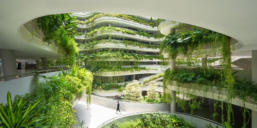
Another Beijing-based story sparking debate in the comments section was Snøhetta's design for Beijing Art Museum, which will feature a series of rectangular volumes radiating around a circular atrium.
Dezeen commenters were largely unconvinced. "Mid design process, Snøhetta unearths a bunch of old CRT monitors in the studio spring clean," mocked Melon.
Deep State drew a similar comparison, suggesting the plan for the museum "looks like a bunch of televisions arranged in a circle."
Other commenters questioned its necessity. "Is there enough art in the entire world to fill every museum in China?" asked Design Junkie. "Every week we have a new billion-dollar museum featured," they added.
Commenter Leo also had doubts, saying "I am amazed by the size of this thing – if it is supposed to be 'a cultural hub for the local community', it looks way too big."
Do you think the design prioritises form over function? Join the discussion ›

"A pearl of a project"
Also getting readers talking this week was a community centre in Finland by Nervin Architecture characterised by its terracotta-toned palette of concrete, brickwork and tiles.
Karl thought the building "has the appearance of a typical Marin County, California office complex from the 1970s/80s".
Meanwhile, Diorama deemed it "beautiful – a pearl of a project." They reflected that "it needs some touches of green on the exterior, some proper interior decor, but it has good, beautiful bones."
"Overhangs to windows is a novel idea – here's hoping it catches on," wrote Jb.
What do you make of it? Join the discussion ›
Comments update
Dezeen is the world's most commented architecture and design magazine, receiving thousands of comments each month from readers. Keep up to date on the latest discussions on our comments page and subscribe to our weekly Debate newsletter, where we feature the best reader comments from stories in the last seven days.
The post "A little over the top but it makes a statement" says commenter appeared first on Dezeen.


