


"The fears raised by those original renderings have been fully realised"


Selldorf Architects' renovation of the National Gallery's Sainsbury Wing has eradicated most of the building's postmodern charm, writes Robert Bevan.
"Flimsy corporate blandness" and an "airport-concourse aesthetic": architects, critics and heritage campaigners alike were aghast when they first saw Selldorf Architects' renderings for proposed changes to Robert Venturi and Denise Scott Brown's 1991 Sainsbury Wing at London's National Gallery.
The extension at the corner of Trafalgar Square is regarded as one of the world's foremost postmodern buildings and listed at Grade I under the UK's heritage protection regime – a rare accolade for such a young building.
The complexities and contradictions of Venturi and Scott Brown's designs have been unnecessarily smoothed out
Its new doors open to the public this weekend, and the fears raised by those original renderings have been fully realised: the complexities and contradictions of Venturi and Scott Brown's designs have been unnecessarily smoothed out.
Most accept that change was needed to turn the wing into the entire gallery's main entrance, improving accessibility and security issues. The entrance level was previously a confusing and crowded mix of cloakroom, shop and baggage checks.
Venturi Scott Brown Associates' (VSBA) original architectural conceit for the entry sequence was that the visitor would move from a dark, compressed space through a colonnade and then a low horizontal slot leading to a grand staircase, a mezzanine, and a contrasting lightness in the galleries above, as if coming up for air.
The listing entry describes the entrance floor as "low and relatively dark… designed to suggest the crypt of an Italian church, or the basement of a Palladian villa". Whatever the intent, some simply found the experience gloomy.
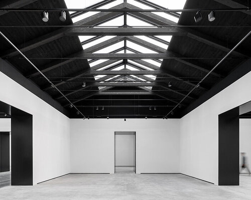
Selldorf's first move has been to change the entrance glazing from smoky to clear and shift the doors from their central position. Instead of moving directly into the entry hall you reach it via a small glazed vestibule to one side which, strangely, faces a fire exit onto flanking Whitcomb Street.
Only then do you dog leg into the main space. Here some signature drum columns have been removed altogether and others recreated on the other side of the space where the shop once stood.
The details are unhelpfully meek compared to the PoMo boldness of the original
This and the large cloakroom have been relocated to the mezzanine and basement respectively, leaving a vast, free-flowing space in which to mill about and lounge on new seating with a giant digital screen and espresso bar on the back wall providing the visual interest. Once-blocked views are available right across the entry hall and out from the building to its palatial context.
The next major move has been to replace the mezzanine, taking large bites out of the floorplate. The aim is a greater connection between levels to allow more light down to the ground floor.
Instead of a single-storey slot, a double-height opening now leads to the foot of the grand stair. At mezzanine level, the small, strangely shaped restaurant – never a great success – and meeting rooms have been replaced with a larger, open-plan restaurant area.
The overall strategy makes sense. The problem lies in the details, which are unhelpfully meek compared to the PoMo boldness of the original.
The deep coffering of the former entrance ceiling soffit has been replaced with shallow scoops dotted with a rash of tentative Murano glass shades. The dinky, underpowered office-like reception desk looks hesitant and temporary. The new glass balustrade to the mezzanine is fronted by a wide but unusable shelf edge, and is absolutely what you would find in a corporate workplace.
Venturi and Scott Brown's original concept of climbing from dark to light, from compression to the soaring space of the staircase, has been substantially undone – and deliberately so.
There feels a failure of nerve
How this fundamental change complies with standard heritage practice is a mystery. Normally, there is a requirement to keep original fabric wherever possible and to respect key elements and concepts of a design.
The most architectonically important parts of a building must be identified and usually retained. Entrance sequences and staircase compartments are frequently highly significant, setting the tone for the rest.
There is no policy in UK heritage law or guidance that supports a different approach to a heritage building because of its youth or style. Commentators have rightly questioned whether the selection system for protecting and altering modern historic buildings is working if such radical change to crucial aspects of character is possible.
Selldorf recounts how Historic England encouraged her to lean in further to the PoMo character of the wing – and, apparently, a round of revisions followed. And indeed, the relocated rusticated columns recall the original work rather than the timber replacements the architect initially envisaged. It's a shame more wasn't done.
Perhaps responding in a more playful postmodern fashion in a post-postmodern period could have simply resulted in pastiche. Yet still there feels a failure of nerve.
The pragmatics of accessibility and security did not demand these particular changes. Double-height slots could have been created to lighten up the ground floor without locating them at the foot of the stair – the very place where the dilution of the dark to light concept causes most damage.
On this evidence, it is not in Selldorf Architects' design vocabulary
The reception desk could have been more emphatic and decorative, a new entrance more celebrated rather than apologetic, the balustrade given weighty confidence. More mannerist in a contemporary manner. But on this evidence, it is not in Selldorf Architects' design vocabulary.
Selldorf worked with UK heritage architects Purcell – among the best – to achieve her vision. Jon Wright, Purcell's 20th century lead, argues it is clear from the documentation that VSBA's design of these spaces went through many iterations, and as such are not core to the design concept.
He had meetings with Scott Brown about the proposals – negotiations probably not helped by Selldorf having previously demolished crucial elements of VSBA's San Diego art museum.
So, is Scott Brown happy with the outcome? "I don't think we got to that stage."
Robert Bevan is a former editor of Building Design and architecture critic for the Evening Standard. He now runs the heritage consultancy Authentic Futures, and is the author of Monumental Lies: Culture Wars & The Truth about the Past, published by Verso.
The photo is by Edmund Sumner.
Dezeen In Depth
If you enjoy reading Dezeen's interviews, opinions and features, subscribe to Dezeen In Depth. Sent on the last Friday of each month, this newsletter provides a single place to read about the design and architecture stories behind the headlines.
The post "The fears raised by those original renderings have been fully realised" appeared first on Dezeen.
What's Your Reaction?
 Like
0
Like
0
 Dislike
0
Dislike
0
 Love
0
Love
0
 Funny
0
Funny
0
 Angry
0
Angry
0
 Sad
0
Sad
0
 Wow
0
Wow
0